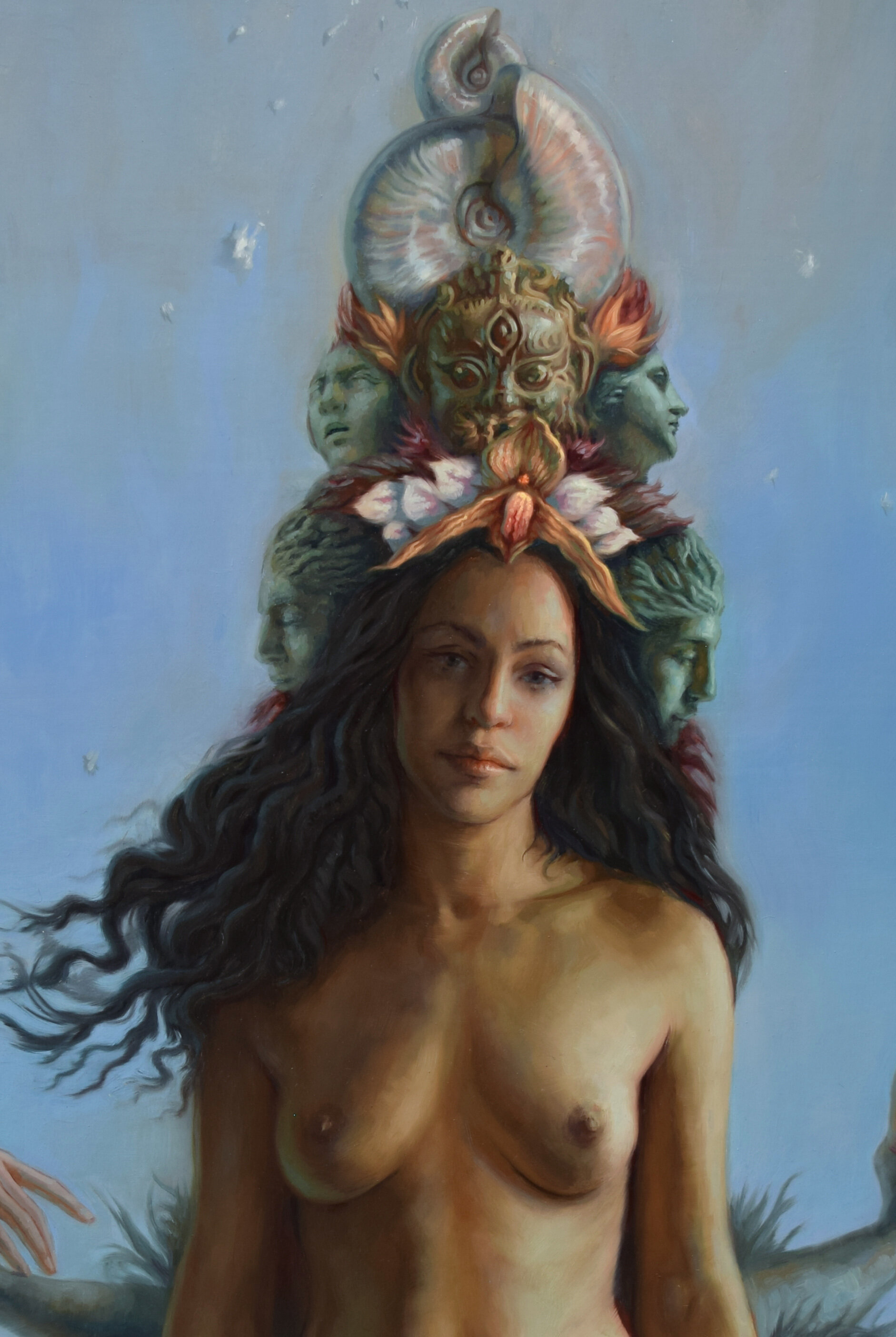
Inspired by Botticelli’s painting of the same title, Birth of Venus represents my first completed large scale figurative painting.
Botticelli’s painting is seen to represent the transition between the 2-dimensional, graphic shape dominate qualities of the Gothic period into the more 3-dimensional naturalistic techniques developed in the Renaissance.
I liked this quality of symbolic shapes in transformation, becoming 3-dimensional. I had also noticed some visual similarities between in Botticelli’s painting and other artworks across the world, such as Tibetan Thangka painting images. I wanted to pull from both territories while creating Birth of Venus.
From inception to completion, this project stood center stage of my attention over the next 1 ½ years.
Prior to producing Birth of Venus, I experienced several failed attempts in working on large-scale projects. I was skilled in painting pieces of small and medium scale, and found it manageable to work on a specific area while keeping my eye on the big picture. But when working on a monumental scale, I was finding it lot more challenging to balance the particulars with the whole—the micro with the macro.
I needed to develop a new system; for this project and any other future large-scale epics.
From a young age, I was moved by the grand narrative paintings particularly from the Renaissance and Baroque periods. I was fortunate to see these works in person when we visited our relatives in Italy. These massive works of raw myth and narrative resonated within me deeply. I felt compelled to find a way to create massive paintings of myth and narrative.
I’ve also had a long time interest in developing systems. During my initial failed attempts in creating large scale, multi-figure paintings and seeing them crumble before my eyes mid-process, I came upon the realization that I could draw upon the digital tools, particularly photoshop, that I learned prior to my classical training when working in the games industry. I thought, ‘why not leverage the flexibility of the digital medium, and use that as a prototyping tool for large-scale works?’
My solution was to use both traditional and digital tools for extensive planning and experimentation, and creation of a prototype. I would then use this prototype to execute the painting.
In hindsight, while this extremely long-handed process was certainly overkill and became its own self-imposed hell-scape, it was essential to navigate through. I think had I not pushed the process to such an extreme extent, I wouldn’t have been able to dial back and pick and choose from the various stages in subsequent projects.
Here's an example of my general workflow on small and medium works prior to this project:
In contrast, the workflow of this project:


The Development of Birth of VenuS
In the Rough
The initial drawing of Birth of Venus was sketched on butcher paper. It was then refined to a medium level of detail on top with tracing paper.
Value Study
Using the finished drawing as a base, I produced a value study on the iPad. At this point in time, only the first retina version of the iPad was available, thus there were no stylus’s. I made a ‘finger painting’ by using a 9-value scale of paint swatches. Painting with my index finger on a small screen enabled me to not get lost in creating details.
Value Study Refined
Using Photoshop, more information was added in the sky and water.
Figure References
At this stage, I began working with models for figure references. Some of these poses, particularly those that referenced floating or flying figures, were very difficult to obtain and needed to place the model in a construction harness. She was incredibly generous with her time, energy, and effort, especially because these poses were so hard to establish and maintain.
Printing and Tracing
The rough drawing was then scanned and printed in sections on extremely large pieces of paper. With tracing paper, each section was refined, using the new reference to produce a finished ‘block-in’ of each area.
Sample Reference Sheet
This slide represents one of many reference sheets I compiled to work from.
Finished Block-In
Each drawing section was scanned back into the computer and compiled in Photoshop to produce the finished block-in.
Monochromatic Digital Painting.
I then attempted to create a complete monochromatic digital painting. I used the initial value study to sample the broad values and then worked into the forms and subtleties from there.
Finished Monochromatic Digital Painting
This slide represents the finished product of the monochromatic digital painting.
Sample Initial Color Study
This is one of the initial color studies using oils. I first printed out the monochromatic digital painting, mounted/adhered it to a board, and primed it with clear acrylic matte medium. After it fully dried, I painted with oils on top.
Alternate Variation in Oils
I wasn’t happy with the overall color relationships and feeling of the piece. Around this time, I went to Hawaii to attend the APA convention with my father. I was struck by the colors of the ocean and its feeling of vastness. This felt more in line with how I originally envisioned the piece. I sought to capture a sense of serenity and beauty, coupled with a perception of vastness, awe, and fear that often comes from looking out into the open ocean. To depict this change in environment, I took new photo references and returned to the ‘drawing board’. I reprinted an updated version of the monochromatic painting, then painted this version in oils.
Refining the Digital Prototype
I liked the overall new direction of the piece. I used my new color oil study to begin the final digital prototype.
Updating the Foreground
I then focused on the foreground and began the refining process.
Posing for the Floating Dead Figure
In the earlier versions of the project, there was a floating dead figure in the bottom left corner of the composition. I was having a tough time getting the figure, water, and reflections to look right. So, during the trip to Hawaii, I asked my father to take some photos of me floating face down in the water. Somewhat comically, there was a wedding reception that gathered nearby in the middle of this photo shoot. Because of the bluff, they could easily see me, but not my father taking the photos. I believe a few folks got scared until I popped up out of the pose. I very much enjoy pulling off a good prank, but unfortunately can’t take credit for this one.
Experimenting with Other Figure Poses. This represents an example of another version of the figure in the lower left of the painting that I experimented with.
Finished Prototype. In the end, I decided to omit all figures in the foreground. However, I still felt the need to include an element of death or disillusion in the painting to at least passively link with the birth/generative elements. If you look closely, you’ll find semi-submerged faces in the water that on first glance appear to be rocks.
Ready to Transfer. Finally, the actual painting was ready to begin. I hired a friend to build the stretcher which I then stretched linen over and primed with oil ground. I then printed out the digital prototype in sections (as the printers I work with aren’t able to print wider than 30 inches). These sections were then aligned and taped together to form the entire image. I put massive amounts of charcoal in the back of the print (in order to transfer the image) and aligned it to the canvas. To my horror, I found the image wasn’t the same size as the canvas. After some problem solving, I realized I had given my friend the wrong dimensions. To my great angst, this required the need to have a new stretcher built and then stretch/prime new linen over it.
Transfer Detail. This second image represents a detail of the transfer process. Lines were drawn on the surface with blue pen to push charcoal on the back onto the canvas.
The Finished Transfer. There was more smudging onto the canvas than I had hoped. On a smaller scale, I use a mahl stick to keep from putting any hand pressure on paper/canvas. At this stage and for this scale, mahl sticks aren’t really a possibility, as you would need to use one that’s over 6 feet long. I was able to wipe some of the smudging away with a cloth doused in mineral spirits. This was tricky as I didn’t want to wipe away the intended lines. Ultimately, having some smudging turned out to be okay, as I was still able to see my lines.
Canvas Size Debacle. After finishing the transfer and beginning the painting, I couldn’t shake the feeling that figures looked too small. Even though the actual canvas size was quite large, the figures seemed oddly small. One of the factors that influenced my decision on how big to make the painting was based on ease of transport through my doorway. I went back to my digital prototype and printed out a version at the absolute maximum size that would be able to fit through my doorway. I invited my students from Georgetown Atelier to give me feedback regarding which size they liked the painting better. Almost unanimously, they preferred the larger version, so I started over, again.
Transfer Detail After Toning. After getting a new stretcher built, surface prepared, and drawing re-transferred, I toned the canvas.
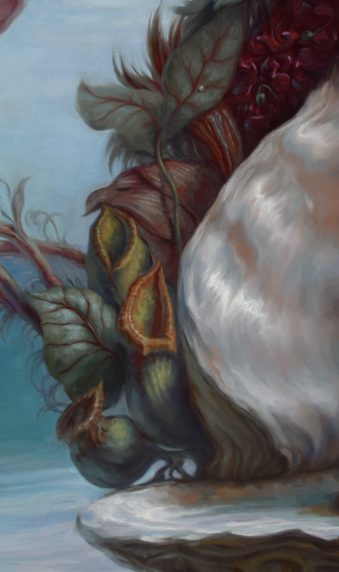
Color Palette. This image shows color strings on my palette that map temperature changes along the value scale. The darker blues correspond with the shadow side of the pitcher plant. As the form moves into the half-tones, it becomes more of a sage/cool green and then warmer green/yellow as it approaches the light. I began the painting by first working on the pitcher plants and large leaves that flank the right of the shell. The tops of the pitcher plants needed their own string progression, as they contain considerably more yellows and reds.
Color References. For the large ‘veiny’ leaves, I harvested the color relationships I found from basil leaves while eating a bowl of pho.
Beginning the Painting. I began by painting the pitcher plants and veiny leaves. Pitcher plants are several different carnivorous plants which have modified leaves known as pitfall traps—a prey-trapping mechanism featuring a deep cavity filled with digestive liquid. The traps of what are considered to be "true" pitcher plants are formed by specialized leaves. The plants attract and drown their prey with nectar.
Plant Additions. My next focus was to add the orchids and other plants.
The Shell. I then moved on to paint the shell. You’ll notice that a small portion of the sky and water along the edges of the plant and shell are also painted. This is to allow ‘wet into wet’ edges to be blended before the paint dries. Unless this occurs, in other words if foreground and background elements are done in separate sittings, it often results in harsh, cut-out looking forms.
Left Side of Plants. My next focus was to begin working on the left side of the plants.
Oyster Shell Reference. I used an oyster shell as my primary reference for the shell that the central figure stands in. To simulate the lighting/color conditions, I positioned a warm toned drafting pencil in front. This allows for the colors in the shadows and reflected light of the shell to look more life-like. The ridge on my thumbnail was from an injury in college. I made a ridiculous claw-glove object in my welding class and ended up hurting myself with it while trying to show off.
Detail of Finished Shell and Plants. Here is a detail of the finished shell and plants. Can you find the small ‘seed pearl’?
Arms/Hands Behind Venus. My attention was next to begin painting the arms/hands behind Venus (one of which is dropping the ‘seed pearl’).
The Head Dress. I began working on the head dress of masks and orchids, cresting with the nautilus shells.
Inside the Studio. A glimpse into one of the moments inside my studio during the long process of painting Birth of Venus.
Figure in Progress. This shows the figure on the right of the painting in progress. This figure is being grabbed and pulled towards the Venus figure (compared to the figure on the left who is gently/admiringly floating towards her, and delicately touching the hand that is reaching out).
Birth of Venus in Spaces

In the Studio (West Seattle) This picture represents the finished painting of Birth of Venus shown on its side in the studio. Remarkably, this painting fits through the doorway directly behind me if angled on a perfect diagonal. Pictured to the right, on the easel, is Semillas in production.

Krab Jab Gallery (Georgetown, Seattle) Here, you see Birth of Venus a few days before my opening at Krab Jab Gallery in Georgetown, Seattle.

Presentation at Krab Jab Gallery (Georgetown, Seattle) Prior to the opening event at Krab Jab, I provided a slide presentation and Q & A about the work and my process.
Axis Gallery (Downtown Seattle)
Georgetown Carnival (Georgetown, Seattle)
Once a year, several thousand visitors converge upon Georgetown to attend an event called ‘Carnival’. The event is a mixture of various forms of art, music, and performances that are characteristic of Georgetown’s more gritty nature. For example, a notable favorite is the ‘power tool’ event where modified tools (such as circular saws) race on wooded track lines.
During the first 7 years of Georgetown Atelier, the school was located at this downtown area of Georgetown, in the bottling plant of the old Rainier Brewery. For a portion of that time, my personal studio was located in the warehouse section of that building. For the Georgetown Carnival, my friend and I jury-rigged Birth of Venus onto the wall shown in the photo (next to the building entrance of my studio). Finding a way to hang the painting from this wall was no less than terrifying. We used a pulley system, of sorts, with wires extending behind the wall, tied to anything we could find that was stable.
It is this warehouse area, and my studio space, which were later used in the filming of Amazon’s Man in the High Castle.

King St. Station (Downtown Seattle)
Here, Birth of Venus is shown at King St. Station in downtown Seattle, in an event sponsored by the Institute of Classical Architecture and Art.
Georgetown Atelier (Georgetown, Seattle)
In this photo, Venus is shown in one of Georgetown Atelier’s annual graduation events.